Akomite
Brand development and web/mobile app
Role
Digital and UI/UX Designer
Industry
Security
Toolkit
Figma, Figjam, Adobe Illustrator and Photoshop
Introduction
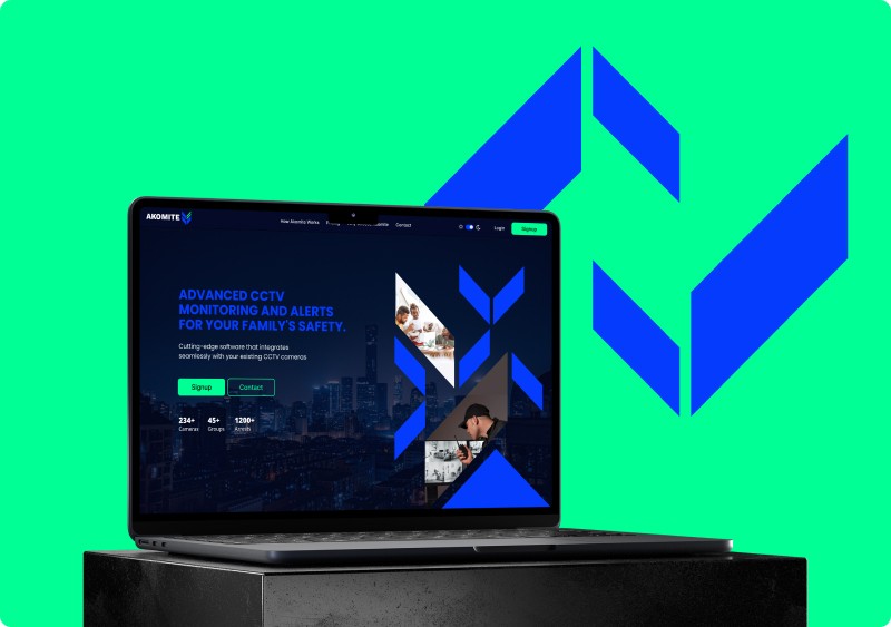
Introducing Akomite, an advanced software solution utilized by monitoring companies to ensure the security of homes, buildings, and complexes. Leveraging AI technology, Akomite automatically sends alerts, providing seamless and efficient monitoring.
Brand Identity Design
This design features bold diagonal shapes inspired by arrows, which indicate the direction of the cameras. The striking design symbolizes Akomite’s role in protection. The dark navy brand color represents technology, while neon green signifies safety.

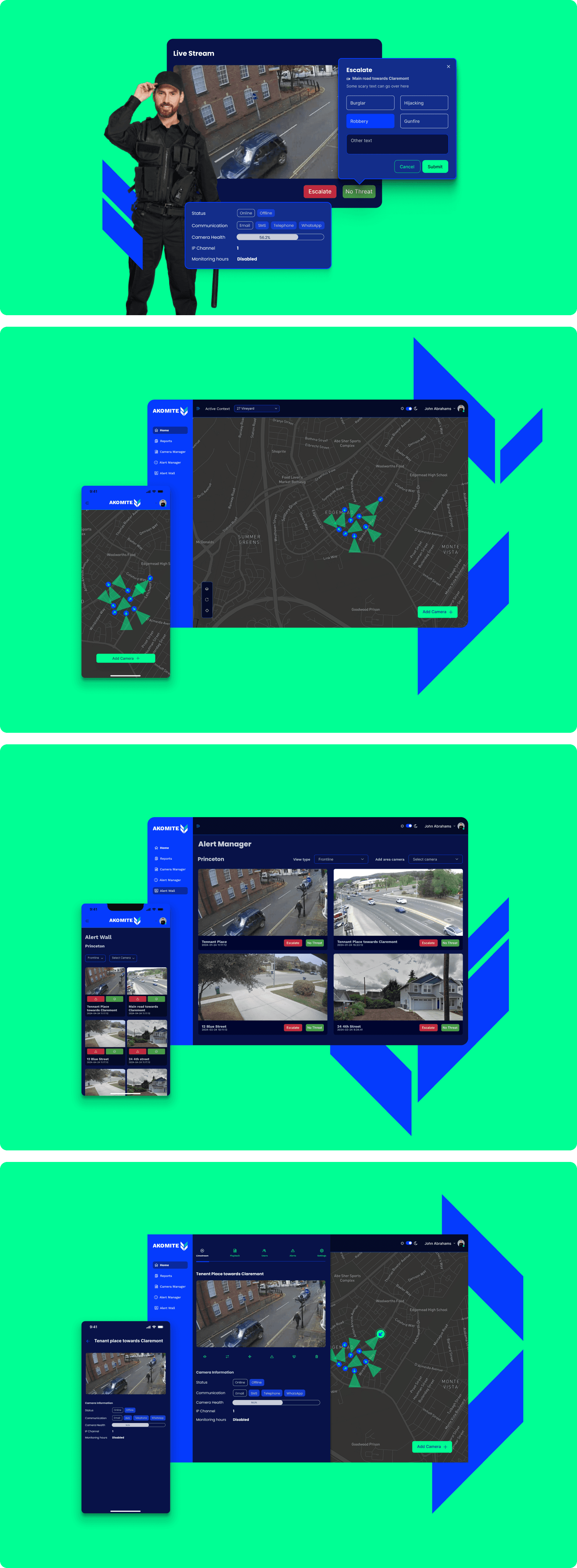
UI design
The UI design was primarily created in dark mode to accommodate the low-light conditions of control rooms. Color hierarchy was carefully respected throughout the design. A key feature is the intuitive map, essential for seamless navigation and efficient area searches.
Goal
The primary goal of the application is to allow users to easily select cameras on a map to view live streams. Its main feature is the ability to trigger alerts seamlessly when prompted, ensuring a smooth and efficient user experience.
Problem
Alerts can arrive rapidly and in large numbers, sometimes leading to them being overlooked.
Solution
To manage the high volume of alerts, filters per area were introduced. Additionally, action buttons were added below the alert cards for easy handling. When clicked, these buttons prompt the user to select the type of alert from a dropup menu, eliminating any guesswork.
Other Projects

gleam
Brand development, web/mobile app and digital media design

Investec
Foreign currency transactions feature in the mobile app